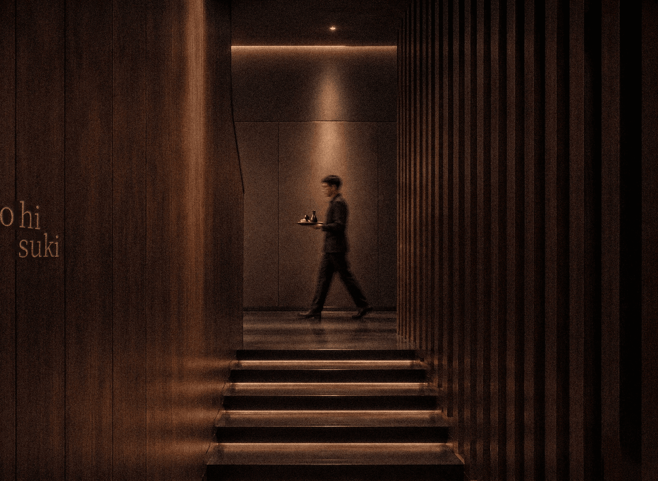
ko hi suki is a contemporary Japanese luxury coffee house shaped around the art of stillness.
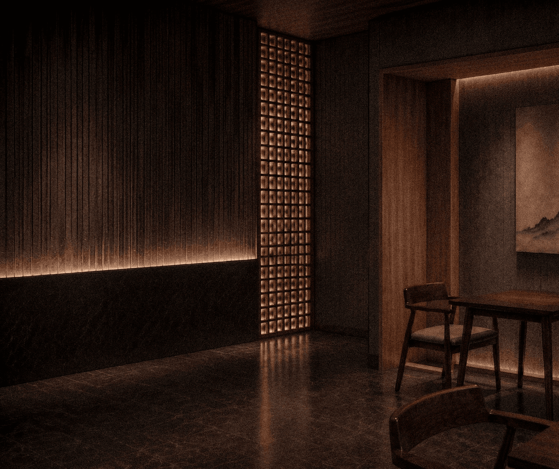
ko hi suki is a Japanese-inspired luxury coffee house created to offer a moment of stillness amidst the pace of modern life.
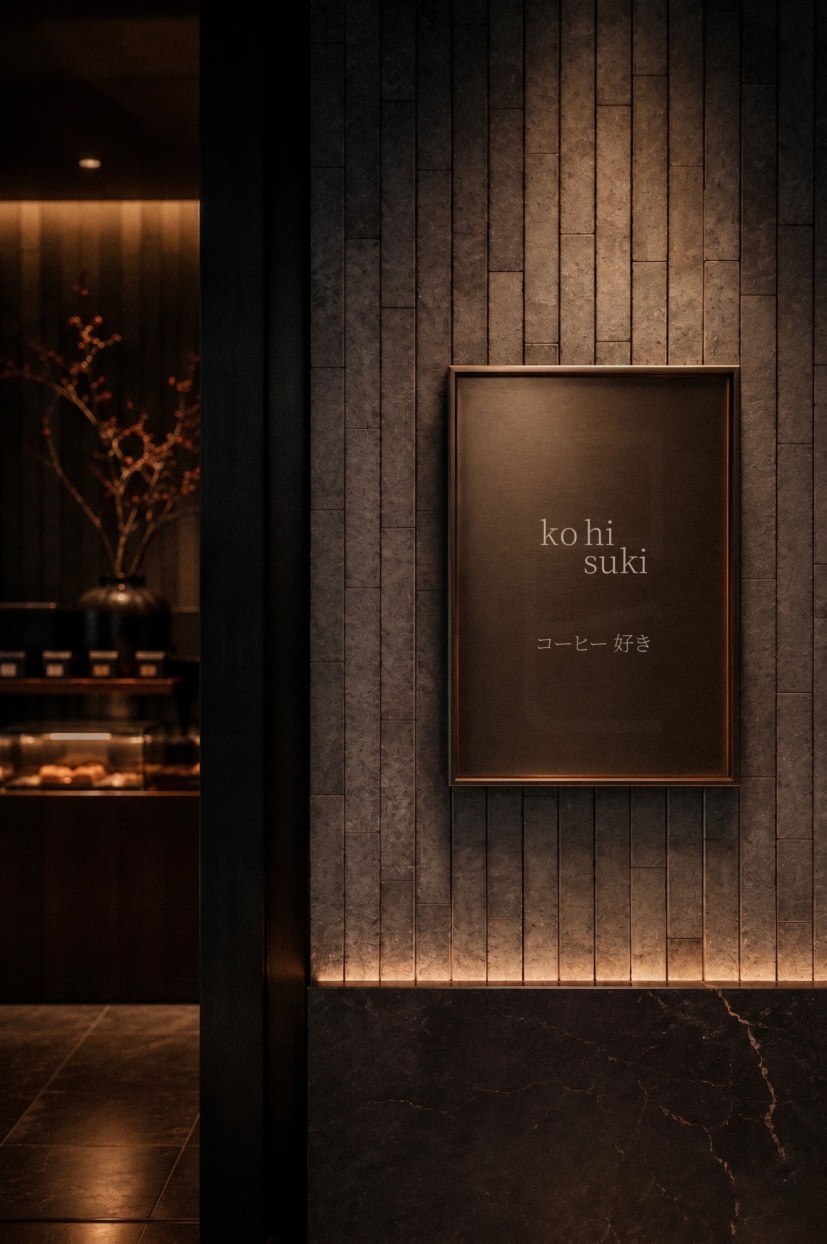
Ruvo developed the brand, space and visual identity for ko hi suki, translating references from Japan’s coffee and tea culture across the interiors, wordmark and wider visual system.
ko hi suki is a Japanese-inspired luxury coffee house, designed with the sole purpose of providing you with a space for still moments away from the noise of the fast-moving world.

ko hi suki
Design Philosophy
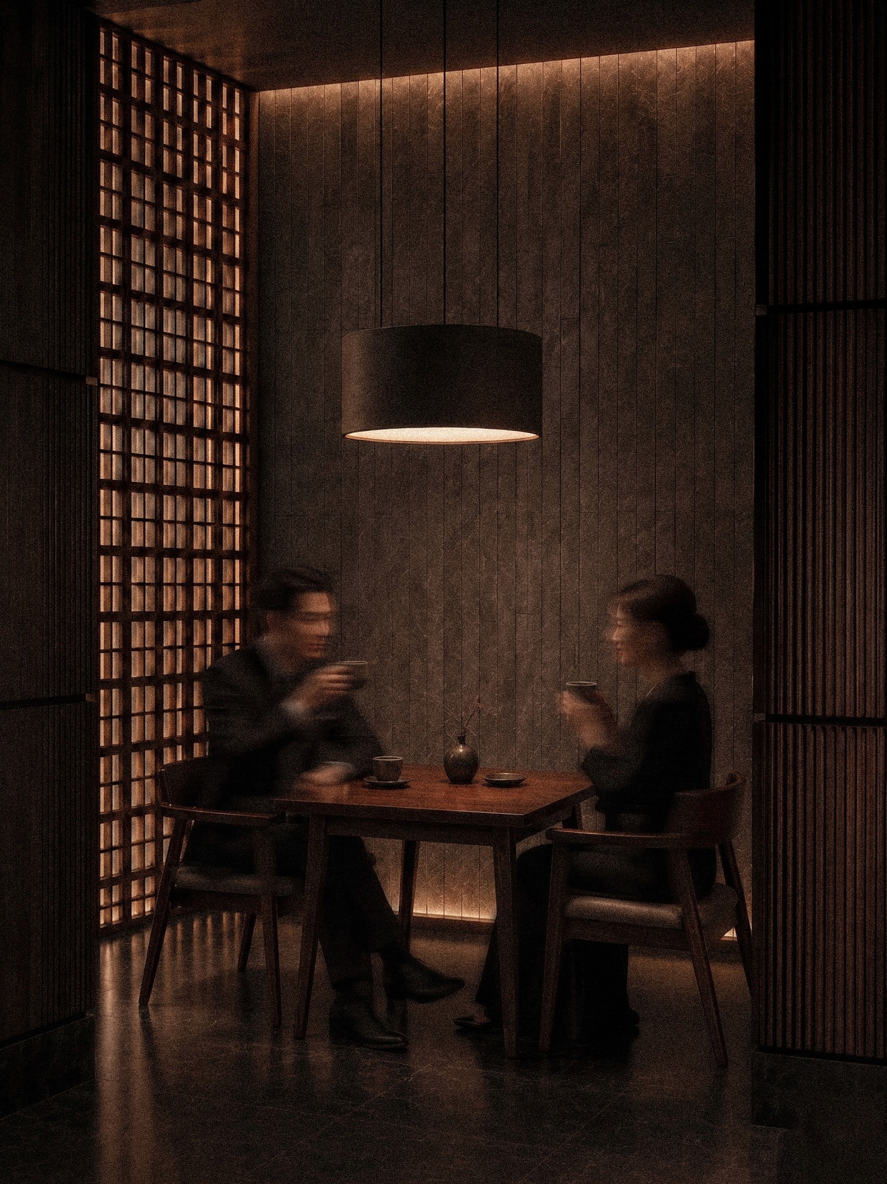
Designed as a space for unhurried conversation and reflection, the brand and interior work together to create an experience that asks guests to slow down through the ritual of coffee and tea.
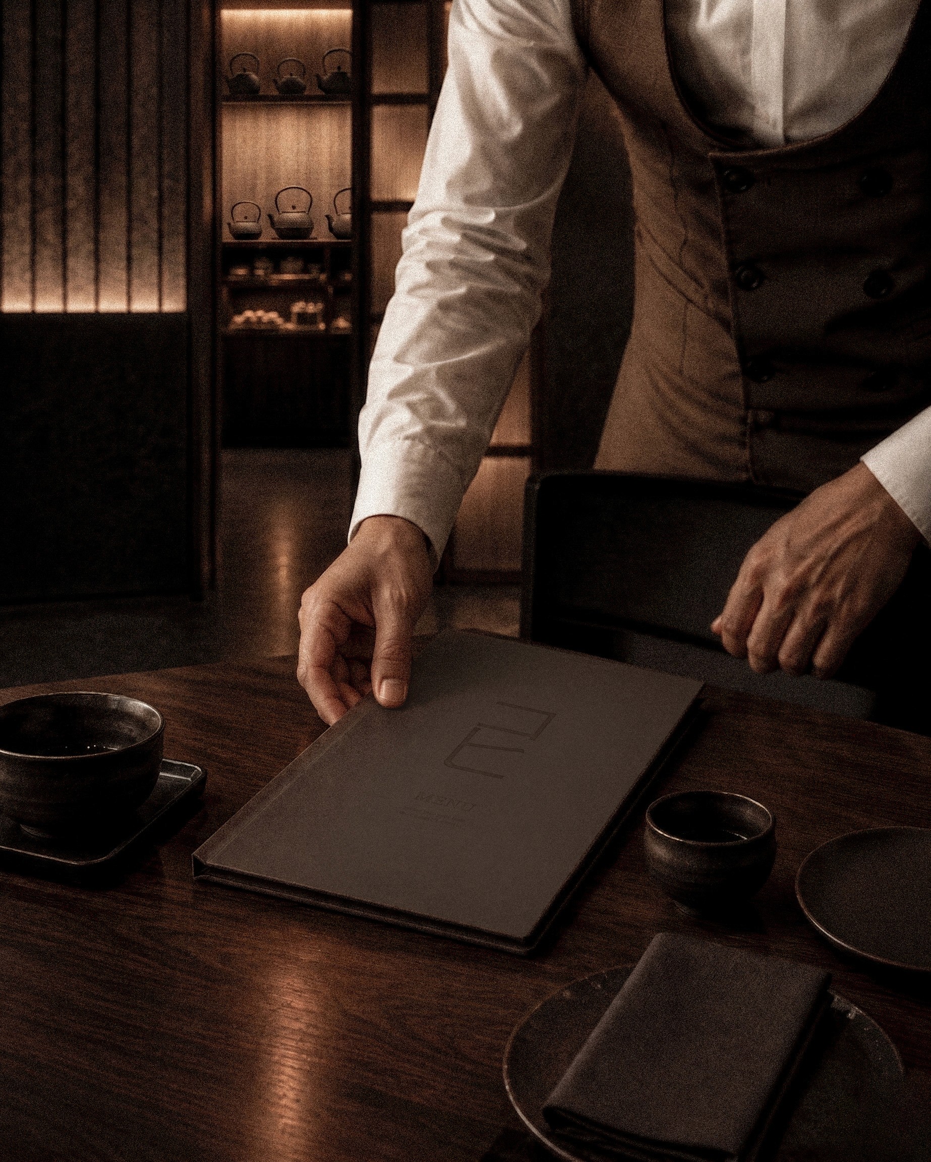
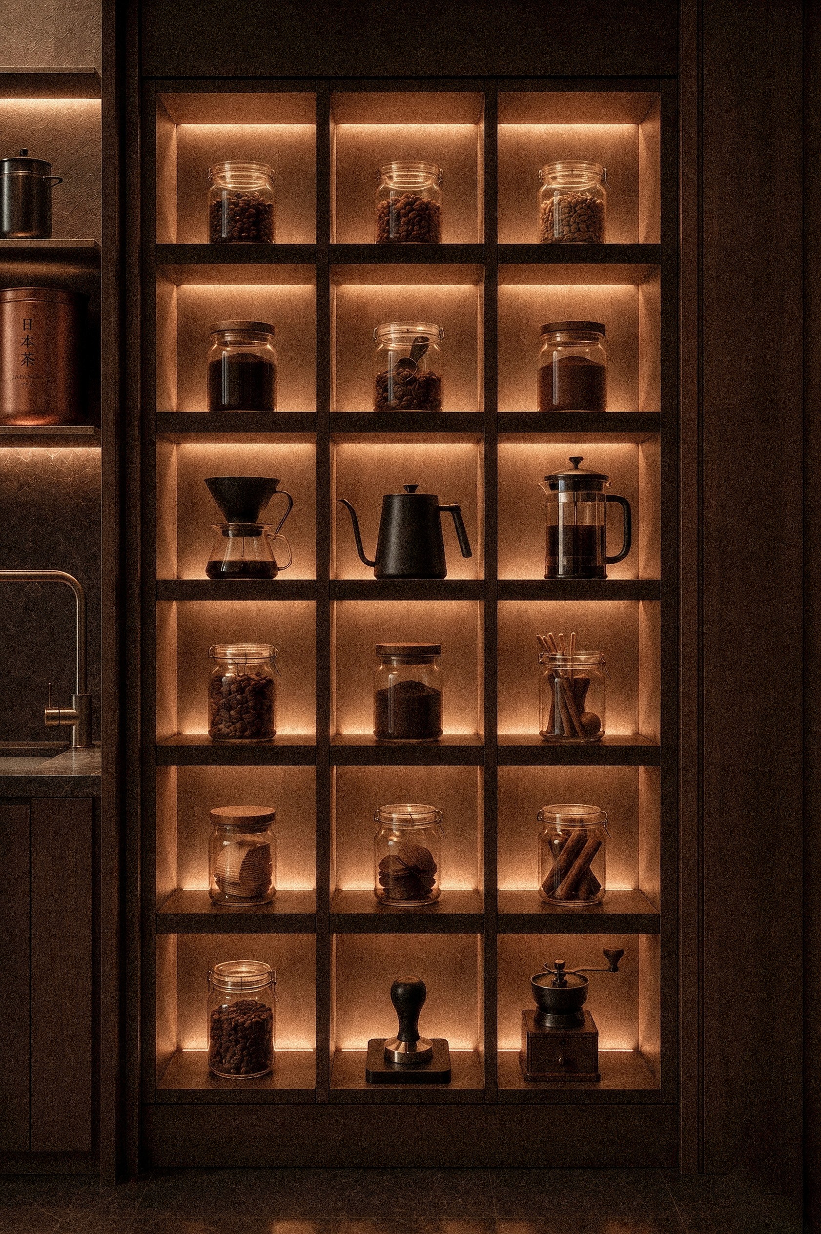
Inspired by Japan's coffee houses and tea culture and reworked with a contemporary edge, the space sets dark, muted tones against minimalist design. Everything in the room is built to create a sense of pause, a calm retreat from the noise of everyday life.
Inspired by Japan's coffee houses and tea culture and reworked with a contemporary edge, the space sets dark, muted tones against minimalist design. Everything in the room is built to create a sense of pause, a calm retreat from the noise of everyday life.
Designed as a space for unhurried conversation and reflection, the brand and interior work together to create an experience that asks guests to slow down through the ritual of coffee and tea.


A Refined Visual Language
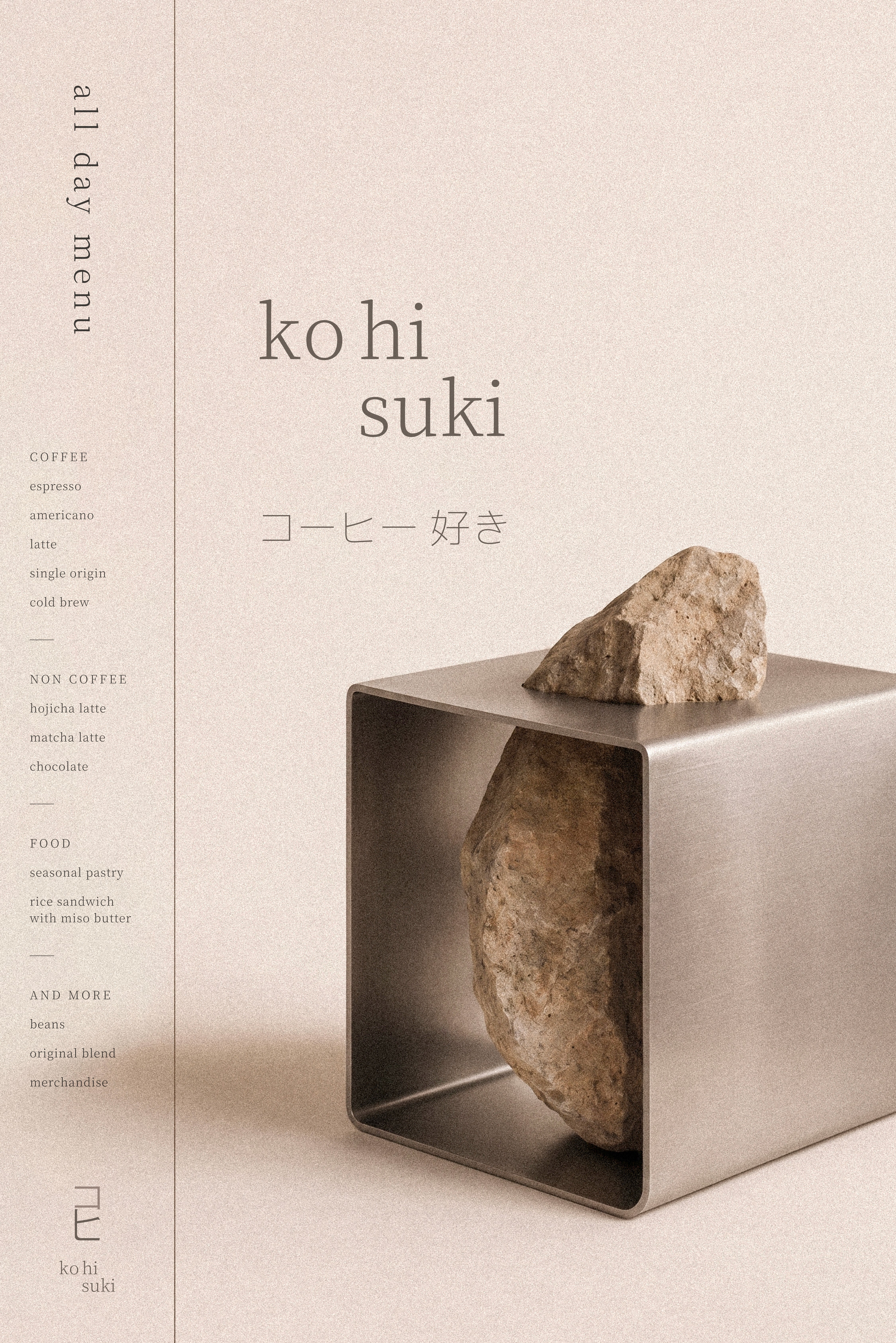
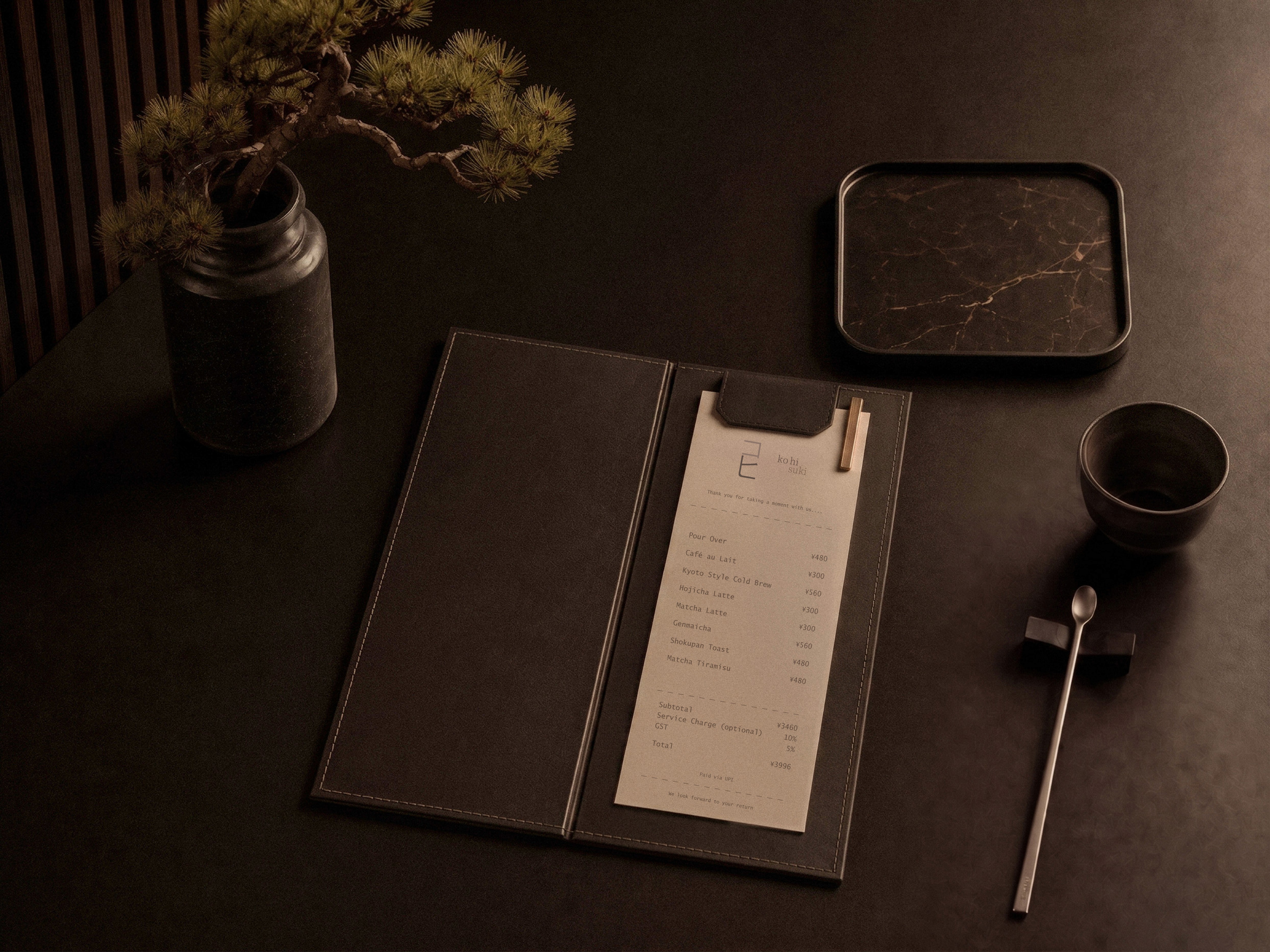
The visual identity is supported by two complementary typefaces. The primary serif draws on the detail of Japanese Kanji and Hiragana, bringing cultural depth and character to the brand. The supporting sans-serif provides a clean contrast, reflecting the simplicity and restraint of Japanese design while keeping everything clear and readable.
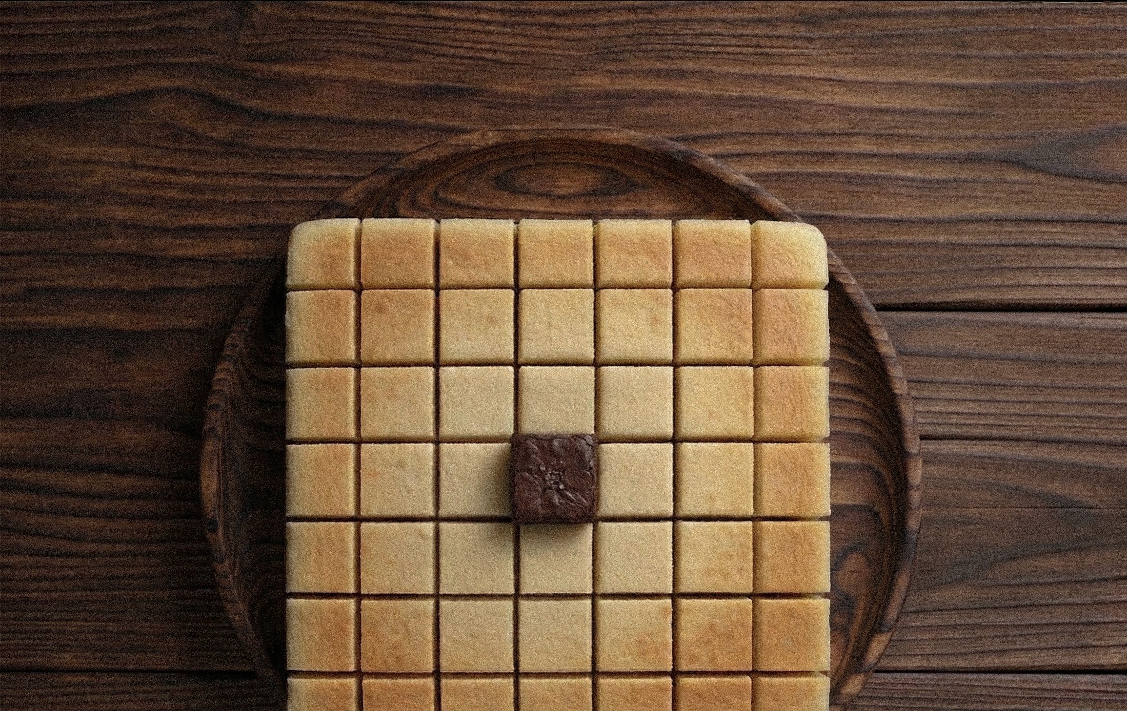
The palette is three core tones: beige, coffee brown and muted taupe, chosen for warmth, balance and depth. Grounded in the rich character of coffee, the palette reflects the emotional and sensory experience of the space while reinforcing its understated sense of luxury.
The palette is three core tones: beige, coffee brown and muted taupe, chosen for warmth, balance and depth. Grounded in the rich character of coffee, the palette reflects the emotional and sensory experience of the space while reinforcing its understated sense of luxury.
The visual identity is supported by two complementary typefaces. The primary serif draws on the detail of Japanese Kanji and Hiragana, bringing cultural depth and character to the brand. The supporting sans-serif provides a clean contrast, reflecting the simplicity and restraint of Japanese design while keeping everything clear and readable.


Explore more works
Explore more works